Obama ‘Hope’ Poster


The Obama “Hope” Poster is an iconic image of the Barack Obama 2008 presidential campaign. Made by graphic designer Shepard Fairey, it was produced in one day and originally distributed and sold as a wall poster. As the Obama campaign grew, the poster became widely accessible via the Internet and became a defining symbol of Obama’s campaign. The original can now be found in the Smithsonian National Portrait gallery, however it can be widely found on the Internet, having found its way into popular culture. In this way, the Obama hope poster has been used as an advertisement and political propaganda piece for the Obama presidential campaign.

At first glance, the ‘Hope’ poster is a depiction of a stylized Barack Obama, balanced over the word Hope. The letters use a strong San Serif Font and frame the piece in a rectangular fashion. This frame is led with a beige edge that contains a strong contrast to the inner shapes of the work. The shapes within the center of the piece are highly polarized and contain many alternating colored vectors that are skewed and lean towards the left. The prominent colors of the vectors are a bold red, dark blue, lighter pale blue, and the pale beige. While most of the colors are solid, certain vectors of pale light blue contain a thin lined texture. The overall shape that is structured is very bold in its geometric form, and contains a high level of color contrast that gives a sense of depth.

Fairey’s ‘HOPE’ poster’s use of bold simplification in form and structure aid in is great deal of effectiveness. Sporting only four colors and the strong typeface of Gotham, Fairy creates a simple but strong concept that is easy to view. The text and shape work together to link the face of Obama to the idea of hope. It shows a great deal of effectiveness in its positive characterization of Barack Obama, affirmed by Obamas use of it during the campaign. Its form delivers a strong sense of Ethos, in that it appeals to a sense of comfort and good from Obamas face. Its use of the word ‘Hope’ gives a sense of comfort, being bold san serif, creating the feeling of confidence and power. For a man aiming to become the figurehead of the United States, this poster was very effective at persuading voters that Obama was the man to trust, as well as being strong willed enough to represent them. The blue colors are strong yet de-saturated, giving an aura of wisdom and trust. The Obama that is represented in the work is one of duty and grace, and the message of Hope became a key characteristic in Obama’s presidential campaign. On the other hand, the bold red color represents the strength in Obamas character. For a man aiming to become the figurehead of the United States, both colors are effective at persuading voters that Obama was the man to trust, as well as being strong willed enough to represent them. Yet above all, the colors are of the flag of the United States, a further part of Obama’s visual political image. Yet in the end, the piece acts as a work of propaganda, similar to that done in Germany and Russia (as well as many nations) during the period of WWII. They are art pieces that serve a nationalistic approach and build up a trust of potential leaders.

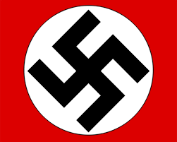
 

The Nazi Logo and the Swastika

swastika swaskika2

The image discussed in this blog is the Swastika, also known by such names as Flyfot, Hakenkreuz, Gammadion, etc. The swastika is an ornamental form of a cross, with each of its arms equal in length, protruding at right angles in a clockwise direction. It’s a twisting shape of interlocking right angled, four prong arms. Without considering the inner white spaces, the four black arms form a perfect square. The logo incorporates other elements like the white circle into which the swastika is centrally placed diagonally to form a diamond shape. White spaces between the interlocking arms form rectangles that are slightly wider than the width of the arms. The black swastika and white circle are centrally placed inside a bright red rectangle whose length is slightly longer than its height. This was the emblem of the National Socialist Workers Party (Nationalsozialisten) abbreviated Nazi.

This political logo was designed by none other than Adolf Hitler when he was put in charge of the fledgling party in 1920. Aware of the need to unite the party and nation around a strong visual symbol, Hitler sought out something that would resonate with the people. Germany was reeling from blows inflicted by war and badly needed reassurance. The answer came in an ancient good-luck insignia.

Until then, the swastika had existed for over five thousand years and was well-recognized as a good fortune symbol around the world. To be certain, it’s still a sacred symbol in Hinduism, Buddhism and other eastern religions. To create a logo for the Nazi party, Hitler appropriated the swastika. Not only did disenfranchised Germans need good fortune going forward after the great war, they needed an easily recognizable symbol to rally around. Also refereed as the “hooked cross”, the swastika is believed to have been used in Neolithic Eurasia.

According to Nazi theory, the Aryan nomads of India had used the swastika in the Second Millennium B.C, and Nazis thought themselves to belong in that ancestry. It’s difficult to make the connection, but Hitler somehow decided the swastika had been eternally anti-Semitic. Elimination of Jews became the clarion cry, a means of achieving ‘racial hygiene’. Transforming a symbol of good luck into one of evil, Hitler projected frustrations of his country towards innocent victims.

Firstly, propaganda was calculated to woo unemployed workers. Economic woes of post war Germany were blamed on Jews. Whoever was responsible for economic hardships was Germany’s enemy and needed to be dealt with ruthlessly. Anti-Semitic notions quickly caught on among unemployed middle class workers. The Nazi logo elicited more hypnotic barbarity than WWI propaganda posters. Adrenalin was high among Hitler’s followers. The Nazi logo seemed to evoke a sense of power and direction. It was bloodbath for the perceived enemy, resulting in the slaughter of an estimated six million Jews!

In his book Mein Kampf, Adolf Hitler himself summarizes both the swastika and the philosophy embodied in its composition and design. “In red we see the social idea of the movement, in white the Nationalist idea, and in the swastika the vision of the struggle for the victory of the Aryan man.” Previously, the swastika was symbolic of the sun’s movement. A day is the space between sunrise and sunset, a period that provides new opportunities. In Hitler’s usage, the new opportunity was to destroy a perceived enemy in order for one ethnic community to achieve its economic goals.

The Nazi logo is arguably the most dreadful and nauseating symbol of the Twentieth Century. It’s impossible to look at it without conjuring up the dreadful holocaust of WWII. It should serve as a teaching aid on the power of symbols, of graphic design, and indeed of the printed page. Designers and artists should be aware of these realities and tread carefully to ensure artworks don’t evolve into devouring ogres.

Sources

“Adolf Hitler Biography Military Leader, Dictator (1889–1945).” Bio.com. A&E Networks Television, 16 Oct. 2016. Web. 10 Nov. 2016.

Holocaust Memorial Council, 02 July 2016. Web. 10 Nov. 2016.

“MEIN KAMPF by Adolf Hitler: Volume 2, Chapter 7 – The Struggle with the Red Front.” MEIN KAMPF by Adolf Hitler: Volume 2, Chapter 7 – The Struggle with the Red Front. N.p., n.d. Web. 10 Nov. 2016.

“The Swastika: A Sign of Good Luck Becomes a Symbol of Evil.” Holocaust Teacher Resource Center. N.p., n.d. Web. 10 Nov. 2016.