Thanks, Lucian Bernard.

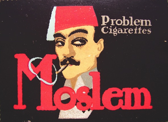
The first decisive blow against the Art Nouveau movement came from Lucian Bernhard in 1906 in the form of a poster. The designer entered a competition to design an advertisement for a German match company, first illustrating a poster using the popular German Jugendstil style. Upon rejection, Bernhard entered a second poster – this one compiled of a plain black background, a pair of matches, and the company’s name. The strategy was addition by subtraction; the designer wished to have control of the viewer’s attention. By showing only the two most important advertising elements on the poster, he was able to do so; and so, the Sachplakat style was born.

Rather than designing with ornamental complexity through the use of Art Nouveau, Sachplakat portrayed products directly, aiming to convey blunt messages to consumers through simplified advertisements. The concept was a revolutionary change in the design world, embracing the concept of addition by subtraction. Companies were no longer able to hire designers that would obscure their product through the complex designs of recent styles. While the style was not well-accepted by all, it was indeed progressive.

Although it was not realized at first, Sachplakat was beneficial to product sales and was a colossal accomplishment in the world of poster design. In comparison to previous styles, this was the first time that the product was the focal point as opposed to a message. Companies aimed to  gain customers through the effectiveness of their product instead of the design of their poster. If this change were to occur today, this would also be effective. Companies could hire designers and product photographers, rather than illustrators. It would take less time to design a poster since there was no need for illustration. The style was greatly effective for product design; however, Sachplakat is not easily transferable to event or service posters. Simplistic design for these things is effective; however, it requires more thought and effort than just portraying a product.

Although introduced over 100 years ago, Sachplakat is used widely in 2016. Many advertisements today use a variation of this style, gaining the attention of passer-bys with plain backgrounds and thoroughly planned typography. Technology companies use this strategy quite often, Apple specifically. Using one sans-serif typeface and a light-colored background, designers illustrate the product name, a catchphrase, and a photograph of the product. Today, designers face issues of which typefaces to use, whether or not to introduce photographs, and color schemes. Like twentieth century Germany, these challenges are faced by trial and error. It is a matter of learning the product audience and trying different strategies to learn what works best for your product. Sachplakat was a revolutionary step in the world of design and paved the way for simplistic blunt design.

Hans Rudi Erdt

Hans Rudi Erdt its an artist born and based in Germany. Erdt is one of the main artists working in the Sachplakat (Poster Style) movement. In the Sachplakat movement, artist wok with simplified forms, colors, and shapes to get an idea across.


A 2658

In “UBoote Herasus” (The U-Boats Are Out!), Erdt uses Sachplakat for the advertising of a movie poster promoting the government film celebrating submarine warfare. This poster breaks things into simplified shapes and colors. The Figure is in the foreground and blocked out into peach, black, and red shapes. The typography in this poster is simple yet experimental. The “U” is centralized in the composition, it encompasses the commander and the boat sinking in the back.  The black silhouette of the “U” and boat echo each other. Although this poster was made specifically for a movie; it still has elements of World War 1 propaganda.

In the Moslem Poster Erdt uses Sachplakat to advertise cigarettes. This poster uses four colors black, red, white, and peach. The background combines effortlessly with the figure in a minimalist fashion. The Cigarette smoke makes a shape that wraps around the “M” in Moslem. Both of these posters show how Sachplakat is used for advertising in different ways.

Manoli Limit poster takes a slightly different approach to Sachplakat. In this poster there is no figure and the main focus is the cigarettes. The box of Manoli’s are open with cigarettes all across the ground. “Manoli” is repeated multiple times, in the title and along with the box. Conceptually, this piece works perfectly because the main focus (the product) is never lost.

Hans Rudi Erdt is an artist that uses Sachplakat to advertise and promote numerous concepts and ideas, from World War 1 propaganda movie posters to cigarette ads.

Works Cited

http://luc.devroye.org/fonts-72220.html

http://www.artfinding.com/28722/Biography/Erdt-Hans-Rudi


El Lissitzky

El Lissitzky, a Russian  artist, designer, photographer, typographer and architect was important during the Russian Suprematism. He designed many works alongside his mentor, Kazimir Malevich (founded this arts movement). These works displayed propaganda and displays for exhibition. His works changed the way one experiments with materials and production techniques, which later influenced the Bauhaus  and carries on to 20th century graphic design. He innovated change in producing photomontage, book production, and typographic exhibitions. El Lissitzky believed that artwork and artists could be used to change surrounding environments. Being of Jewish origin, he created books in order to help spread and share his culture through Russia. During this time, Russia was going through many changes.

His artworks, like many during this time were focused on basic geometric forms in limited colors and abstraction. Centered and based around right angles and grids. Text were often also placed at an angle. This different from the classic art usually based on what we see (Prouns: establishment for New Art). El Lissitzky’s piece “Beat the White with the Red Wedge” was one his most popular posters. In the image, we see shapes of primarily white, black and some grey. These simple composition is broken by a large red triangle placed in the center of the frame. This was said to symbolize the environment in this time period- the bolsheviks fighting their opponents during Russian Civil War.

02cellissitzkybeatthewhiteswiththeredwedge

This helping begin the Constructivist movement. His works similar to these helped spread that art is not only what you see, but also can spread an idea or phase through simple shapes and forms.

https://www.britannica.com/biography/El-Lissitzky

Kurt Schwitters

Kurt Schwitters was born in 1887 in Hanover, Germany. He was mainly associated with the Dada movement but he was also in the Constructivist and surrealist movements as well. Along with graphic design, he worked with paint, sculpture, poetry, collages and typography. In 1918, he was invited to exhibit his abstract paintings at Herwart Walden’s gallery in Berlin. There, he associated himself with the Berlin Dadaist but pretty soon was rejected by them and because of this, the term Merz was created.

“Merz” became an umbrella term for his dada-like art. It was kind of like his brand name for majority of his artworks, not only that, but he used it so often that he ended up referring to himself as “Kurt Merz Schwitters” or just “Merz.  He was known for using papers found on the street to make art. He then used that art to make political statements. His works mirror his environment and activities in his daily life because he would use almost anything to create his collages with, even receipts, newspapers, etc. His works juxtaposed Abstraction and realism, Art and life.

Below, is one of Schwitters’ collages called En Morn (1947). This piece was made to be a poster and cover page of Tate’s Brittan exhibition. The collage is made up of different types of papers, newspapers, and magazines. The focal point of this image is the picture of the girl on the right side of the cover. Below her is an upside down picture of a man. These two pieces are surrounded by cutouts that are laid on top of one another. At the very bottom are words that run across from one side of the image to the next which read, “These are the things we are fighting for.”

2013-04-17-schwitters_bannerk_enmorn1947b

Schwitters’ collage style spread through Europe and even the United States. He will be known for “Merz” because it influenced the graphic design works the most. The Merz images are known to be his greatest contribution to 20th century art. He also thrived in making the official typeface of Hanover, Futura. His style of work later inspired the works of many successful Dadaist artists.


Work cited:

Webster, Gwenda. “Kurt Schwitters.” Kurt Schwitters. N.p. 2011. Web. 21 Oct. 2016. < http://www.artchive.com/artchive/S/schwitters.html&gt;


Marinetti’s introduction of Futurism

The artist known as Filippo Tommaso Marinetti was an Italian poet unlike many of the avant-garde of the time. At a time of dynamic cultural and industrial change within Europe and much of the world, a division had formed around the merits of technological growth and its relationship to the natural world. Marinetti took the side of the hard right, publishing the Futurist Manifesto on the 5th of February 1909 in La gazzetta dell’Emilia. With its publication came about the start of the Futurist movement, calling for a rejection of the past, and a celebration of speed, machinery, violence, youth and industry. Futurist artists experimented with the fragmentation of form, the collapsing of time and space, the depiction of dynamic motion, and dizzying perspectives. Marinetti, like many other Italian Futurist at the time, wanted a modernization and cultural rejuvenation of Italy, whatever the cost. For Marinetti, war was the perfect solution for a new and powerful Italy, a view that is represented in many of his works, most notably “Zang Tumb Tumb” c.1914. Despite a distinct style in the early Futurist movement, works like this offer a look into the spirit of the futurist movement and Marinetti’s loathing of the old.

As a political writer and poet, Marinettis works emulated the feelings and aggression of his environment. Written just one year before Italy’s entry into the First World War, “Zang Tumb Tumb” acted as a precursor to the violence, a visual and auditory glorification of war. The book is an account of the battle of Adrianopolis (Turkey) in 1912 in which the author volunteered as a Futurist-soldier. Its use of strong visual language (most notably in the cover) sets up an image of battle, set up bold and confident as a solute to the practice. It does so through different typefaces, some hand-designed, of various size. The tuuumb repeated on the cover emulates the sound of battle, ringing and dynamically growing. The title of the work is written skewed and bold along the Tumb, continuing the visual representation of the intensity and chaos of battle. Despite the intensity and movement of the cover, the image of the war is made in a encouraging manner rather than fearful. The onomatopoeias ring with valiance and confidence, seemingly encouraging the act.

filippo-tommaso-marinetti-zang-tumb-tumb-1912-min

“Zang Tumb Tumb” Filippo Tommaso Marinetti, 1914

Not but one year after the publication of “Zang Tumb Tumb” Italy had joined the war and had begun a movement into fascism and aggression, a reflection of Marinetti’s will. His publication of the manifesto brought about an era that linked up to Italy’s place in the world, inspiring many like Umberto Boccioni, Carlo Carrà, Luigi Russolo, Gino Severini, and Giacomo Balla. Although much of Marinettis credibility and favor ran dry with his support of Mussalini and fascism, his influence of the culture of art in Italy cannot be denied. His vision for Italy would hold strong for many decades until fascism finally ended in Italy.