![]()
This image is the logo for the Japan-based automobile manufacturer, Toyota Motor Corporation. This version is featured in screen-based advertising, as well as on Toyota vehicles in the form of a three-dimensional emblem. Introduced in 1989, this mark was designed to commemorate the fiftieth year of the company and served to rebrand the company as it gained prominence in foreign countries. The Toyota logo is widely recognized today as the face of most popular automobile manufacturer in the world.
The logo consists of three intersecting ovals of various sizes, all vertically centered with one another. The largest of the ovals is widest in its horizontal dimension and contains the remaining two ovals within its boundaries. One of these inside ovals is about three-quarters as wide as the outside oval and nearly half as tall. Additionally, this inside oval shares its upper edge with the larger outside oval. The second inside oval is narrow, with a width of about a quarter of that of the outside oval. Vertically, it extends from the top edge to the bottom edge of the outside oval, intersecting the other inside oval.
All three of the ovals are formed by thick contours that slightly vary in width, reminiscent of a calligraphic stroke. Furthermore, the sharp contrast between highlights and shadows creates an appearance of bas-relief. The coloration of the strokes consists of multi-directional gradients of white to dark gray, suggesting a reflective surface, and the direction of the gradients alludes to a light source from the upper left corner.
The logo for Toyota reflects the company’s primary product: automobiles. The intersecting ovals express fluidity and motion, the essence of a moving vehicle. Furthermore, the conjoined strokes suggest a strong unity of parts, while the logo’s axial symmetry provides harmony and balance to the design, all qualities of a well-crafted, high-functioning machine. The calligraphic nature of the strokes subtly references the company’s Japanese heritage, while also optically balancing the logo by evenly distributing the weight of the design through the adjustment of the strokes’ widths. The metallic coloration of the logo calls to mind the strength and durability of metal, which is often associated with industrial advancement and superior quality. Additionally, the metallic finish conveys the feeling of luxury and timelessness that is regularly ascribed to the material. Lastly, amongst all of these design elements, exists an abstract “T” formed by the intersection of the two inside ovals, a clever allusion to the company’s name. Through its simple sophistication and abstract expressiveness the Toyota logo design succeeds as a highly recognizable, stand-alone mark for an equally recognizable brand of automobiles.
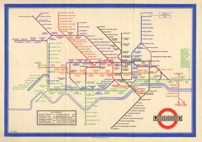 He used the same weight in line and differentiated the single stops and the transfer points by using sizing. Beck and Wyman seemed to have the same vision in creating a simple, clear and straightforward map to be used by locals and visitors. The map’s purpose is to show people how to navigate themselves around the DMV area. Coming from depending on driving everywhere to being savvy in how to get from point A to point B without confusion is an successful design created by Wyman because using the simple elements like color and shapes don’t usually confuse people if that’s all they have to focus on. The metro map allowed me to learn about other ways of transportation and to be come cultured within my environment.